ComparisonAdviser Website Redesign
The ComparisonAdviser (CA) site was originally a loose collection of paid search landing pages. CA wanted create a cohesive look and feel for these disjointed landers and build a large organic search site. I created a style guide, redesigned the landers and created templates for article pages, category pages and author profiles. This included a pattern library of reusable element that the copy writers could easily add to their articles.
Final Design, Desktop

Home Page Hero
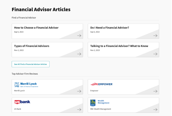
Articles Section
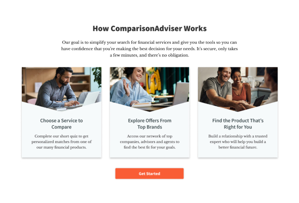
Process Section

Health Landing Page Hero
Final Design, Mobile Layout

Home Page Hero

Articles Section

Process Section

Health Landing Page Hero
Concept
Both management and the SEO team had a clear vision for the blocks of content they wanted to show and the order of their placement on each page. I decided to start with a color scheme and the typography to establish consistent branding for the new organic search pages as well as existing paid search landing pages.
I then moved on to low-fi mocks of the main page templates for the organic site. The organic site was the priority as this was a new revenue opportunity. The paid search landing pages would be addressed second since they were already live and converting traffic.
Design
While the main blocks of content were decided by the stakeholders, the look and feel of the elements within these sections needed to be finalized. I presented prototypes to the team. Here I championed what I thought was best for the user experience: consistency, intuitiveness and clarity. I also deferred to my teammates when it came to knowledge of our audience and SEO best practices. During the design process I created a pattern library to make sure like elements shared the same styles.
When everyone was satisfied with the final design, I moved on to the paid search landing pages and updated those pages based on the new style guide and pattern library.
Code
I created these pages in WordPress and used a combination of custom code and plugins. One of the main goals was to create elements in the WP admin so they would be easy to edit by the copywriters.
Responsive styles and mobile page performance was another goal for these pages. Special attention was given so these pages would look good in all popular devices and browsers. I used Google’s Lighthouse and WebPageTest.org to check the performance status. I take these results, interpret them the best that I can, and constantly test possible solutions (Google does not always explain how they arrived at a performance score).