QuoteWizard Infographic and Custom Icons
The QuoteWizard (QW) design team was small and while each of us were mainly web designers, we were expected to wear many hats and support all departments in the company. This included creating graphic assets for banner advertisements, emails, websites, print products such as brochures and displays for tradeshows. Below is small of sample of the projects I worked on.
Infographic

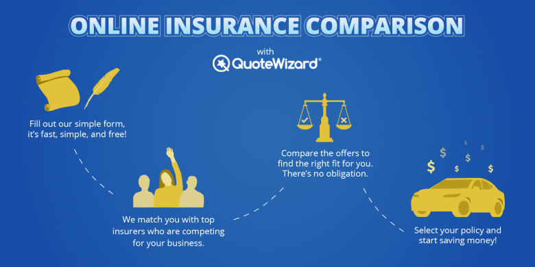
Many visitors to QW’s website and landing pages are not familiar with the company and may not feel comfortable continuing to our form. I created different graphics throughout the years to help provide some information about the process to offer some transparency. This infographic is one example that was used on landing pages and emails.
Custom Icons

The QW SEO team redesigned their large organic search site. It was a big project and we wanted to make sure that we were putting our best foot forward. While working with the UX designer, it was determined that most of our competitor site looked and felt the same. It would be an advantage to take steps to make our site different and stand out from the crowd.
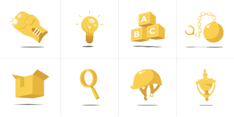
Some of the ways we made our site unique was with language and tone, presenting similar services in different ways, and using custom design elements. I noticed that a lot of site used the same icons over and over and after visiting a few competitors it started to feel like noise. I created a set of icons to help break this fatigue and hopefully call more attention to the messaging around these icons.